Coming Soon
in Dallas
in Dallas
Strong hero headlines, card subdivision names and major entrances.
A live visual directory of typography, colors, gradients, buttons, and pills configured in the theme, mapped to their specific contexts.
Current design direction rendered as working components and copyable CSS. Midnight is a controlled cool-navy family; Heritage Blue remains the signature historical accent. This lab is for selecting and documenting the system before any production rollout. v3.2.9 keeps the navigation-glass proof tests, preserves the Hybrid Glass Lab, and adds independent Panel Corner Radius, Panel Light-Piece Radius, and Panel Return Radius controls to the Global Glass Engine Lab so the outer panel can be squared while the bright bottom/right return can be tested as a straight-edge painter without changing compact badge geometry.
Changes photos only inside this private style-guide lab. Use direct image URLs to judge glass, scrims, status badges, and banners over real listings.
A cool Midnight family supplies the almost-black foundation. The brighter Heritage accent is intentionally a different blue family, preserving the RHA-connected signature without forcing teal into every dark surface.
#005EFF · conversion/electric#002F80 · glow/glass test#114775 · controls#0F4569 · gradient helper#218CCC · signature accent--sc-ink: var(--sc-midnight-13); /* #000C21 */ for the “not black, but our black” text on Ice and Paper surfaces. Use Midnight 07–20 as a controlled family according to depth; this avoids forcing one shade to do every dark job.#HEX format. Transparent glass, masks, shadows and scrims use rgba(...) with companion RGB-channel helpers only because their opacity is part of the recipe.
/* Steavy @ Compass / Current Token Direction v3.0 */
--sc-midnight-07:  #000712; /* deepest ink / scrim endpoint */
--sc-midnight-10:  #00091A; /* immersive canvas */
--sc-midnight-13:  #000C21; /* selected ink / core dark surface */
--sc-midnight-15:  #000E26; /* lifted dark surface */
--sc-midnight-20:  #001232; /* photo-derived navy */
--sc-midnight-50:  #002F80; /* cool glow / glass candidate */
--sc-midnight-100: #005EFF; /* electric conversion candidate */

--sc-deep-blue:     #114775; /* branded controls */
--sc-bridge-blue:   #0F4569; /* gradient helper only */
--sc-heritage-blue: #218CCC; /* signature / Heritage tint */
--sc-luxury-gold:   #D4A84B; /* rare concierge detail */
--sc-vivid-emerald: #10B981; /* selected / confirmed / positive lifecycle */
--sc-ice:           #E5F0F4; /* page canvas */
--sc-paper:         #FFFFFF; /* readable surface */
--sc-ink:           var(--sc-midnight-13);

/* Alpha helpers: only for glass/scrim recipes that need variable opacity */
--sc-midnight-13-rgb: 0, 12, 33;
--sc-midnight-50-rgb: 0, 47, 128;
--sc-deep-blue-rgb:   17, 71, 117;
--sc-heritage-rgb:    33, 140, 204;
--sc-emerald-rgb:     16, 185, 129;
--sc-paper-rgb:       255, 255, 255;
Three font jobs only: ZacbelX makes the entrance, CompassSans does the work, and CompassSerif signs the name.
Strong hero headlines, card subdivision names and major entrances.
Refined section headers and quieter editorial display moments.
A refined, highly readable system for facts, property descriptions, controls, labels, and app navigation.
Clean paper surface, Midnight 13 ink, and controlled tracking.
Large photo-overlay treatment shown with the heavier inline hero settings currently found in the listing template.
This is the single-listing main-title attitude: ZacbelX pushed beyond normal brand-map bold, very tight line-height, wide uppercase tracking, and a real photo-overlay shadow. Use it for hero words, subdivision/city title overlays, and rare high-impact section openers only.
/* Display / Hero Fat — Single Listing Main Title */
--sc-type-display-fat-family: "ZacbelX", "Montserrat", sans-serif;
--sc-type-display-fat-weight: 900;
--sc-type-display-fat-tracking: .17em;
--sc-type-display-fat-line-height: .92;
--sc-type-display-fat-transform: uppercase;
--sc-type-display-fat-shadow: 0 6px 26px rgba(0,0,0,.45), 0 2px 8px rgba(0,0,0,.38);
/* Typography Roles */
--font-display-bold: "ZacbelX", sans-serif;   /* weight: 800; major hero/display headers */
--font-display-medium: "ZacbelX", sans-serif; /* weight: 500; quieter display headings */
--font-ui: "CompassSans", sans-serif;          /* body, facts, navigation, controls */
--font-identity: "CompassSerif", serif;       /* Steavy / Presented by / Listed by only */
--text-ink: #000C21;                         /* Midnight 13: our not-black ink */

/* Special display token */
--sc-type-display-fat-family: "ZacbelX", "Montserrat", sans-serif;
--sc-type-display-fat-weight: 900;
--sc-type-display-fat-tracking: .17em;
--sc-type-display-fat-line-height: .92;
--sc-type-display-fat-transform: uppercase;
The public property world is editorial. The tour experience is immersive. Concierge tools may carry rare gold detail. They share tokens without being identical.
Ice canvas, Paper reading panels, Midnight 13 ink, refined Deep Blue action.
Midnight 10 canvas, glass controls, vivid photography, Emerald selections.
Night-mode discovery with specialty gold accents only where details deserve ceremony.
Good Eats/* Interactive Shape System */
.badge { border-radius: 5px; } /* informational only */
.pill { border-radius: 999px; } /* elongated interactive control */
.button { border-radius: 7px; } /* primary/submission action */
.icon-button {
width: 44px; height: 44px;
border-radius: 999px;
background: #114775; /* solid icon/control */
color: #FFFFFF;
}
.icon-button--glass {
background: rgba(33,140,204,.37);
border: 1px solid rgba(33,140,204,.69);
backdrop-filter: blur(5.2px);
}
Restored from the earlier studio: the ghost drum is a signature app interaction, while the concierge POI drum keeps Gold rare and meaningful.
/* Ghost Drum / Selected App Rail */
background: rgba(33,140,204,.31);
border: 1px solid rgba(33,140,204,.72);
backdrop-filter: blur(5.2px);
-webkit-backdrop-filter: blur(5.2px);
border-radius: 999px 0 0 999px;

/* Concierge POI / Specialty Detail */
color: #D4A84B; /* Luxury Gold: rare map/discovery moment only */
Property-first photography stays clean. Lifecycle glass identifies the moment; the data banner frames information without swallowing the photo.
/* Listing Card Information Banner / Live Candidate */
background:
  radial-gradient(circle at 78% 22%, rgba(33,140,204,.12), transparent 34%),
  linear-gradient(180deg, #000C21 0%, #000712 100%);
/* HDR / Photo Enhancement / Natural Lift */
.photo-layer {
  filter: saturate(1.10) contrast(1.08) brightness(1.02);
  -webkit-filter: saturate(1.10) contrast(1.08) brightness(1.02);
}
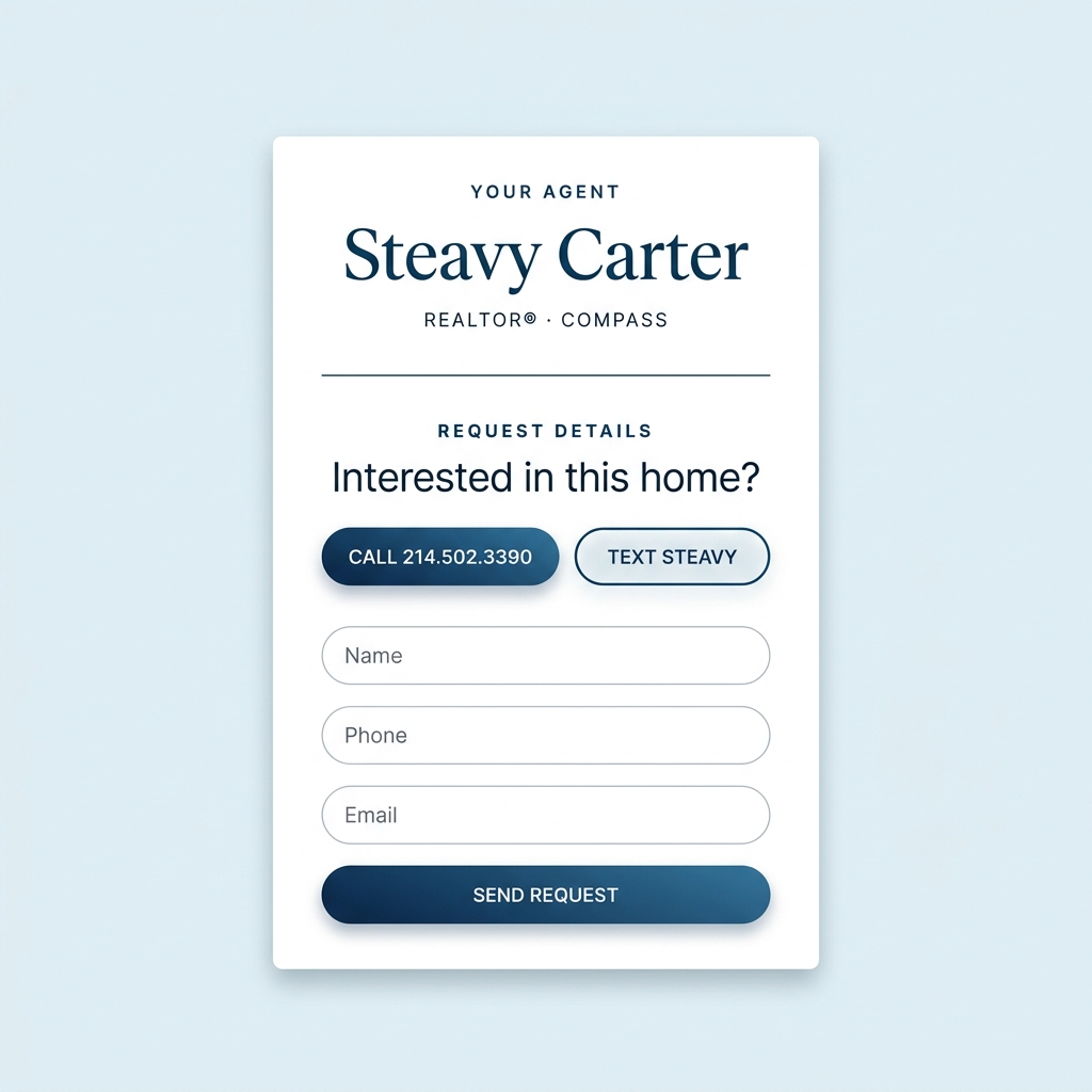
This is the actual lead-capture design language: Navy Wash over the listing photo, a deep translucent form card, and a bright conversion-only CTA. The second frame shows the related hero/address treatment as a visual bridge to the card-rail experiment.
/* Tour Login / Sign-In Navy Wash / Active Token-Aligned Reference */
.start-page-overlay {
  background:
    radial-gradient(ellipse at 30% 30%, rgba(var(--sc-deep-blue-rgb), .45) 0%, rgba(var(--sc-midnight-13-rgb), .78) 100%),
    linear-gradient(to bottom, rgba(var(--sc-midnight-13-rgb), .25) 0%, rgba(var(--sc-midnight-13-rgb), .80) 100%);
}
.welcome-badge {
  background: rgba(var(--sc-heritage-rgb), .37);
  border: 1px solid rgba(var(--sc-heritage-rgb), .69);
  backdrop-filter: blur(5.2px);
}
.glass-card {
  background: rgba(var(--sc-midnight-13-rgb), .76);
  backdrop-filter: blur(24px);
  -webkit-backdrop-filter: blur(24px);
  border: 1px solid rgba(var(--sc-ice-rgb), .16);
}
The clean-photo alternative to the full lower banner: a masked pseudo-element now fades the transparent tint and the backdrop blur together, so the rail dissolves into clear photo instead of stopping at a glass rectangle.
Use decision: both candidates now test the exact “blur dissipates into clarity” idea. Candidate A masks blur out toward the right edge of the address rail; Candidate B masks the full shelf tint and blur out toward the clear upper photo so its top edge does not read as a hard banner line.
Compare photographic lens blur layers against Glass-Only backdrop blur: both can dissolve at the focus boundary, but Glass-Only blurs the live photo underneath without rendering a duplicate image layer.
Depth distinction: Single and Progressive modes render one or two blurred copies of the photograph for a camera-lens look. Each duplicate layer now has its own Spread → Blur → Opacity workflow: spread controls registration, blur controls softness, and opacity blends that softened copy back into the sharp original. Glass-Only adds a transparent masked backdrop-filter layer over the sharp photo and disables duplicate-layer controls.
Drop-in use: the copy button now exports a complete scoped <style> block plus matching HTML markup for the currently selected treatment. Replace the photo URL and text, then use it only for a selected hero/card moment rather than as a sitewide default.
Reference translation: the CodePen glass-tilt example uses a pseudo-element with backdrop-filter: blur(5px) plus a linear mask, matching our Glass-Only method. The classic Design Shack tutorial stacks a blurred image over a sharp background copy and masks the blurred image, matching our Single Masked Blur approach. Source references: CodePen CSS Tilt Shift · Design Shack Tilt Shift.
This lab now tests the full nearby-capture method honestly: the navigation stays fixed while the photo or red orb begins below the hidden sampling zone and is scrolled upward toward it. Nothing starts already inside the glass. The test isolates whether nearby color blooms into the navigation before the approaching content crosses its visible lower edge.
 Coming Soon
How to judge it: click Reset Start first. Switch between Standard Directly-Behind Blur and Enhanced Nearby Reflection Capture to test the method. With enhanced capture active and visible tint temporarily lowered, the red bloom should appear in the glass while the orb is still physically below the visible navigation edge. Adjust Reflection Spread / Main Glass Blur to tune how far that bloom feathers; the 200% overscan remains fixed. Edge thickness may stay at 0px; it is optional polish, not the reflection source.
@supports..site-header__backdrop extends below the header and is masked back after blur sampling.overflow:hidden or clip-path.pointer-events:none; navigation content remains above them.overflow with border-radius; consider overscroll-behavior:none for flicker testing.Tune a single glass recipe live, then judge it on a Pill, Icon Button, selected toast, and caption/title bar overlay. Official colors remain HEX tokens; transparency recipes display RGBA because opacity is part of the material. Lifecycle badges remain lower-blur exceptions.
/* Badge / Lifecycle Status / Coming Soon / Heritage Glass */
background: rgba(33,140,204,.51);
border: 1px solid rgba(33,140,204,.69);
box-shadow: 0 4px 30px rgba(0,0,0,.10);
backdrop-filter: blur(1.5px);
-webkit-backdrop-filter: blur(1.5px);
color: #FFFFFF;
border-radius: 999px;

/* Badge / Lifecycle Status / Now Active / Emerald Glass */
background: rgba(16,185,129,.58);
border: 1px solid rgba(16,185,129,1);
box-shadow: 0 4px 30px rgba(0,0,0,.10);
backdrop-filter: blur(1.5px);
-webkit-backdrop-filter: blur(1.5px);
color: #FFFFFF;
border-radius: 999px;
True variable tuner for the shared SC glass system. The same settings are shown as a Coming Soon-style compact badge and a larger frosted panel over the global photo source. The Panel Corner Radius slider squares off the large panel without changing the compact badge. The Panel Light-Piece Radius slider controls the internal surface/rim painter shape independently, and the Panel Return Radius slider isolates the bright bottom/right return so wide return spreads do not create a giant rounded blob in the lower-right corner.
Use this surface to judge large cards, modal panels, listing intelligence trays, and photo-backed property modules without changing the production glass engine.
Click a color to load it into the selected target. Target buttons update tint, highlight, contour, return, or shadow color.
/* SC Glass Engine Variables */
/* Compact Badge + Panel Geometry */
Testing actual-card-scale geometry for the Hybrid Glass lifecycle badges. The badge is placed at top: 8px; left: 8px; over a real property photo.
Candidate A
min-height: 24px, pad: 0 8px, size: 10.24px
Candidate B
min-height: 26px, pad: 0 11px, size: 10.5px
Candidate C
min-height: 28px, pad: 0 12px, size: 11px
Candidate A
min-height: 24px, pad: 0 8px, size: 10.24px
Candidate B
min-height: 26px, pad: 0 11px, size: 10.5px
Candidate C
min-height: 28px, pad: 0 12px, size: 11px
The live photo stays beside the controls while you adjust the material. Test the same hybrid as a lifecycle pill or a larger glass panel. The Daft Plug reflection remains fixed so the upper-left edge catches more light than the lower-right edge.
0 while judging repeatable Coming Soon and Now Active card badges; copied CSS then requires no SVG filter dependency.
Use Heritage as the lit signature moment, Deep Blue as the usable branded control, Bridge only when a transition needs quiet complexity, and the Midnight family for depth.
linear-gradient(135deg, #218CCC 0%, #114775 48%, #000712 100%)
linear-gradient(180deg, #114775 0%, #000C21 56%, #000712 100%)
linear-gradient(135deg, #218CCC 0%, #0F4569 50%, #000712 100%)
linear-gradient(135deg, #007AFF 0%, #0055D4 100%)
linear-gradient(135deg, #005EFF 0%, #114775 100%)
Only recurring UI families belong in the brand contract. These translate the Tour Clipboard and Open House Builder patterns into a common system: floating navigation, selection feedback, informational messages, disabled controls and destructive actions.
.sc-app-dock, .sc-icon-button, .sc-pill--selected, .sc-toast--success, .sc-toast--info, .sc-action--destructive. Emerald communicates a selected/confirmed outcome; it is not a general navigation blue.The Worker repeatedly renders search/location controls, filters, pins, preview cards, popups, selected-time chips, results drawers and toasts. These are product UI, not one-off experiments. Glass is a strong upgrade candidate for controls and popups because they sit over map imagery.
Forms, filter panels, modals and detail panels occur across app pages and listing experiences. Interactive controls may be rounded and tactile; editorial reading panels may stay architectural and square.
This is the handoff map for AG: migrate reusable components to global semantic tokens and approved classes page by page. Do not globally replace old HEX colors without understanding their role.
| Source Page / Module | Reusable Elements to Standardize | Approved Brand Direction | Recommended Upgrade |
|---|---|---|---|
header-2.phpheader-app.php |
Desktop/mobile navigation, header CTA, menu controls; legacy gradient family #005485 / #0B6EA3. |
Header Navigation Glass recipe with Deep Blue or Heritage selected by context; CompassSerif only for identity/logo text. | Lab first Use nearby-capture glass for scrolled/photo states; retain opaque fallback for readability. |
template-tour-start.php |
Sign-in Navy Wash, glass form card, input/button states, bright Start Tour CTA. | Midnight Frost + Navy Wash; preserve electric Start Tour as intentional conversion exception. | Standardize Move raw dark tones into Midnight tokens; form focus and errors into state tokens. |
template-tour-clipboard.php |
Floating dock, settings drawer, notes modal, accordion, Lux/Fun review, toast and progress states. | App Shell dock; Midnight Frost panels; Heritage interaction; Emerald confirmed/selected only. | Standardize Replace legacy #001524/#004A75 and mixed greens by semantic component tokens. |
page-open-house-tour.phpopen house worker 0515.js |
Map top search, Filters/Key controls, pins/clusters, mobile results drawer, listing preview cards, popup actions, selected-time chips, toasts. | Map UI family; Glass popup candidate; Arctic/Deep Blue control glass; approved marker/state roles. | Upgrade candidate Test glass popups and map-menu controls over real Mapbox scenes before shipping; preserve solid fallback. |
single-listing.phpproperty-details-panel.php |
Hero title, price/facts, reading panel, showing/tour/text actions, taxonomy pills and Gold accents. | Display / Hero Fat title; Paper editorial details; Deep Blue primary action; Luxury Gold #D4A84B. |
Standardize Normalize current gold and keep reading surfaces square/restrained rather than glass-heavy. |
cs-listing-grid.phpcomingsoon-grid.phpcs-card.php |
Lifecycle card grid, results/filter controls, badges, facts/address line and CTA. | Coming Soon Heritage Glass; Now Active Emerald only for lifecycle transition; approved scrim/rail/shelf card treatments. | Standardize Use shared grid/filter/control classes and eliminate isolated slate/legacy-blue recipes. |
ex-map-widget.phptemplate-ex-map-page.php |
POI markers, category pills, map cards/popups, local discovery actions. | Concierge mode with Midnight atmosphere and Luxury Gold for POI/discovery emphasis. | Standardize Normalize old Gold #D4A039 to approved #D4A84B; reuse map popup surface rules. |
Checked against the earlier Brand Studio, Gradient Studio, Lifecycle Glass, Card Surface and Midnight Comparison files. This is the working inventory of design tests carried forward.
| Earlier Lab Tool / Example | Status in Current Library | Where It Lives Now |
|---|---|---|
| Experience Modes: Editorial, Dark App, Concierge | Included | Experience Modes + Control Language |
| Palette / Blue Role Comparison | Upgraded | Midnight 07–100 family, Deep, Bridge, Heritage, Gold, Emerald |
| Light / Dark Pills, Buttons and Icon Samples | Included | Control Language |
| Drum Selector Baselines | Restored | Ghost Drum + Concierge POI Drum |
| Gradient Recipe Picker + Custom Tuning | Merged | Gradient Builder + Preset Recipes |
| Lifecycle Glass Badge Tuning | Restored | Photography + Lifecycle Cards |
| Named Glass Material Family | Added | Arctic Glass, Arctic / Heritage Tint, Deep Blue Glass, and Midnight Frost recipe cards |
| 4:3 Photo Card Baseline | Standardized | All active photography test frames now render at 4:3 |
| Address Glass Rail + Gradient Shelf Surface Test | Upgraded | Card Overlay Rail Lab: masked blur dissolve rail and masked blur-dissolve Gradient Shelf |
| HDR + Radial / Blend / Hero Scrim Tests | Upgraded | Photography + Lifecycle Cards with Natural Lift and Super HDR photo-layer study presets |
| Sign-In Navy Wash + Tour Login Glass Card | Restored | Photography + Lifecycle Cards / Tour Login Reference |
| Zacbel Extrabold vs Medium Weight Comparison | Restored | Typography |
| Selective Edge / Tilt-Lens Blur Study | Upgraded | Selective Focus / Blur Gradient Lab with duplicate-photo spread controls plus Glass-Only backdrop blur |
| Header Navigation Glass Lab | Corrected + Proofed | Nearby-capture glass now separates visible tint from the fixed masked 200% overscan plane, identifies blur as the visible spread control, and includes an honest red-orb proof scene. |
| Reusable App Shell + Interaction State Language | Added | Floating dock, selected/confirmed state, feedback toast and destructive/disabled state baselines from the Tour experiences. |
| Map UI / Glass Popup Upgrade Study | Added Candidate | Reusable Builder map tools, marker roles, popup card and time/action controls derived from the Open House Worker. |
| Panels + Editorial Property Details | Added | Filter/form surface and quiet Paper reading-panel rules for shared listing/app components. |
| Production Migration Map | Added | Page-by-page reusable component standardization plan and legacy-value replacement guardrails. |
| Single-Listing Main Title Token | Defined | Display / Hero Fat token for super-heavy, tracked ZacbelX title moments |
| Old Click-to-Shortlist Utility | Historical | Not an active design treatment; preserved in the diary below rather than steering current tokens. |
Consistency by experience mode, not one radius or one blue terrorizing every page.
| Context | Recommended Foundation | Controls + Restrictions |
|---|---|---|
| Editorial Property Page | Ice canvas, Paper content panel, Midnight 13 ink. | Restrained Button or quiet Badge. Protect photography; avoid glass reading panels. |
| Coming Soon Grid | Clean 4:3 photo, Radial Card Scrim, Midnight banner family. | Compare full data banner against experimental Address Glass Rail; Heritage Glass Badge; Emerald only for the Now Active lifecycle transition. |
| Tour Sign-In | Sign-In Navy Wash photo overlay + Midnight glass form card. | Bright Start Tour CTA may remain electric; ZacbelX title at 800; address/UI stay readable and restrained. |
| Open House Builder | Bright map context with floating glass tool surfaces and a mobile results drawer. | Arctic/Deep Blue control glass candidate; Heritage map pins; Emerald = selected/confirmed only; glass map popups must retain readable fallback. |
| Clipboard Tour App | Midnight canvas with Clipboard Blend photo treatment. | Floating dock, Midnight Frost panels, glass toast, selected states and deliberate Fun/Lux review interactions. |
| Ex-Map / Concierge | Midnight 07–10 with atmospheric Heritage glow. | Luxury Gold for POIs and rare discovery accents only. |
| Future Hero/Search | Photography-first with carefully tested glass. | Arctic/neutral glass or selective-focus blur may be tested; do not glassify or blur every photo by default. |
Note: The following sections document the historical creative process, earlier component definitions, and previous shortlists. This content is preserved as a diary and may contain superseded thinking. For current governing styles and CSS recipes, refer to the Current Brand Asset Library above.
This is body text rendered in CompassSans. It is optimized for small size readability, used across commute details, property specs summaries, and footnote details (Regular).
Used as primary utility typeface for inputs, labels, and map overlays.
Gold is a functional accent — used for tier markers, achievement badges, and data visualization on the EX Map. It’s not a brand color. Compare the current gold against three alternatives that better complement the navy/blue palette.
Heritage Blue (#218ccc) is energetic but grounded (Saturation: 72%, Lightness: 46%). Neon Mint (#16C98D) is slightly more saturated and lighter, giving it that "startup" pop. Below are options that try to capture the exact energy of Heritage Blue, but in green.
The current Ice (#E5F0F4) has a slight cyan/green undertone (196° hue). Since our core brand is built on true blues (202°–205°), shifting the Ice hue slightly will make it sing in perfect harmony with Heritage and Steavy Navy.
The current font colors rely heavily on default Tailwind values (slate-900, slate-500) and an orphaned "Deep Blue" (#0e4f73). The proposed system eliminates those and pulls exclusively from your core luxury palette, ensuring perfect harmony between backgrounds, buttons, and text.
Every premium brand runs on 5 colors or fewer. More than that and you’re not curating — you’re guessing. Here are the five that tell your story.
These colors currently exist across your codebase but create visual noise. Consolidating them into the 5-color core palette above will make your brand feel 10× more intentional.
Gradients are your brand in motion. They should tell a story, not just fill space. Three is enough to cover every context; more than three is chaos.
A luxury brand never uses 4 typefaces. Three is the maximum: one for display (the thing that stops you), one for interface (the thing that guides you), and one for reading (the thing that informs you). Every additional font dilutes the system.
Compass provides a Serif font for agent names and identity-level text. You already have it loaded (CompassSerif Bold + Regular). The question is: does it earn a spot in your system? Below are three contextual mockups showing where it would live.
These are rendered using your actual loaded font files — not AI approximations. Compare the stroke endings, the “y” descender, the “g” shape, and how each pairs with ZacbelX.
border-radius: 50px) are the universal marker of luxury digital design. Square or slightly-rounded buttons feel utilitarian — they say “enterprise software.” Pill buttons say “boutique.”border-radius: 4px, 6px, 8px, and 50px. That inconsistency is one of the biggest “MySpace” tells — standardize to 50px and the entire UI instantly feels cohesive.
Right now your glass treatments vary: some cards use rgba(255,255,255,0.06), some use 0.08, some blur at 6px, some at 12px. These tiny inconsistencies add up. A client can’t articulate why something feels “off” — they just feel it. One recipe. Everywhere.
A quick-reference table for every element in the current inventory. KEEP MERGE RETIRE EVOLVE
| Element | Current Use | Verdict | Action |
|---|---|---|---|
| #004a75 | Buttons, card borders, primary CTAs | KEEP | Promote to PRIMARY. Absorb #005485, #1e4d74, #0e4f73. |
| #218ccc | Map POI, travel headers, banner | PROMOTE | Elevate to SIGNATURE ACCENT. Hovers, links, gradient starts, active states. |
| #001524 | Tour Start background | KEEP | Sole dark background. Absorb #001524. |
| #E5F0F4 | Homepage body wrap | KEEP | Light mode page canvas. Never use flat #fff for page backgrounds. |
| #15803d | Active / Now Active badges | KEEP | Universal “active / go” signal. No change needed. |
| #005485, #1e4d74, #0e4f73 | Various near-duplicate navies | MERGE | All → #004a75. Imperceptible visual difference. |
| oklch(0.5 0.28 270) | graffiti.css theme token | RETIRE | Browser support risk. Replace with #004a75 hex. |
| #007aff / #0055d4 | Tour Start submit gradient | RETIRE | Apple system blue = “default.” Replace with Heritage Flow gradient. |
| ZacbelX | Hero titles, overlays | KEEP | Display only. Never below 1.2rem. |
| CompassSans | UI elements, buttons, specs | KEEP | Primary UI font. Takes over all Montserrat duties. |
| Inter | Body text, descriptions | KEEP | Long-form reading. Descriptions, disclaimers, system text. |
| Montserrat | Map buttons, inputs, filters | RETIRE | Most-used free font = “template energy.” Replace with CompassSans. |
| Button Radius | Mixed (4px, 6px, 8px, 50px) | STANDARDIZE | All buttons → 50px (pill). Circle actions stay 50%. |
| Card Radius | Mixed (10px, 12px, 16px, 20px) | STANDARDIZE | Cards → 16px. Modals → 20px. Badges → 999px. |
| Verdict Pills | Green/Yellow/Orange/Red gradients | KEEP | Color-coded feedback is functional, not decorative. This is the right kind of playful. |
| Card Body Gradient | #005485 → #004a75 (invisible) | EVOLVE | Replace with Heritage Flow (#218ccc → #004a75). Make it a brand statement. |
These represent the current selections and definitions. They are organized by approval status and contextual constraints.
